Talking about climate change
in 7 seconds
JAMES GOLDIE
Data and Digital Storytelling Lead, 360info
Hi!


360info is an open access global information agency that tackles the world’s biggest challenges and offers practical solutions.
Keen to collab with research groups and media outlets!
Today
- Short vs long read
- Language, jargon and complexity
- Uncertainty in spatial data
- Conclusions
Slides
https://numbats2022.talks.jamesgoldie.dev
(Code for these slides is at https://github.com/jimjam-slam/talk-numbats-2022)
Short and long reads
TV graphics: the short read
TV graphcs: the long read
| Long view bad ❌ | Long view better ☑️ | |
|---|---|---|
| Short view bad ❌ | Bad chart | Requires context or time |
| Short view good ☑️ | Misleading/reductive/ oversimplified | 🥳 |
Layered complexity: climate stripes

Climate stripes in their original form
Layered complexity: climate stripes
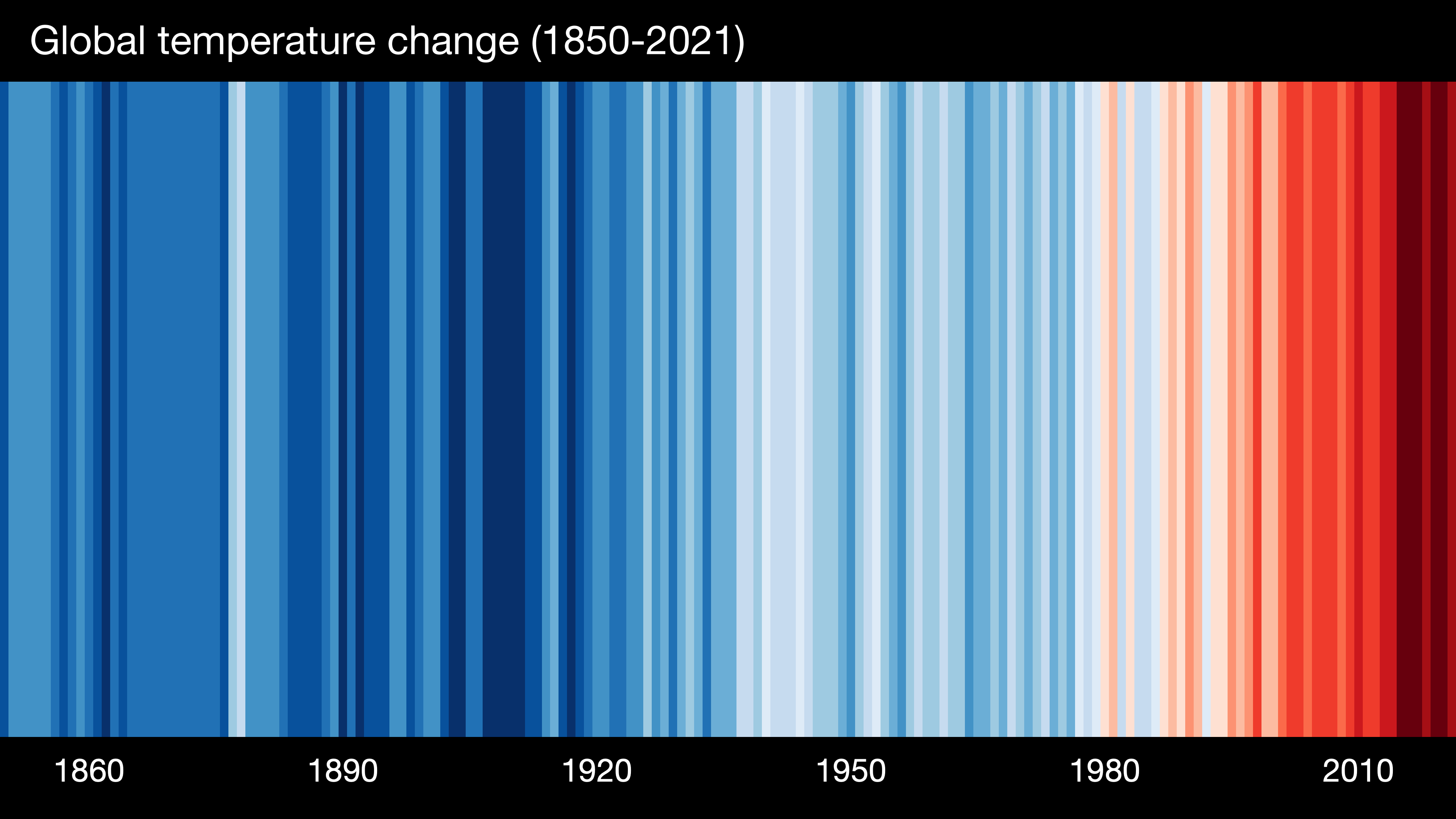
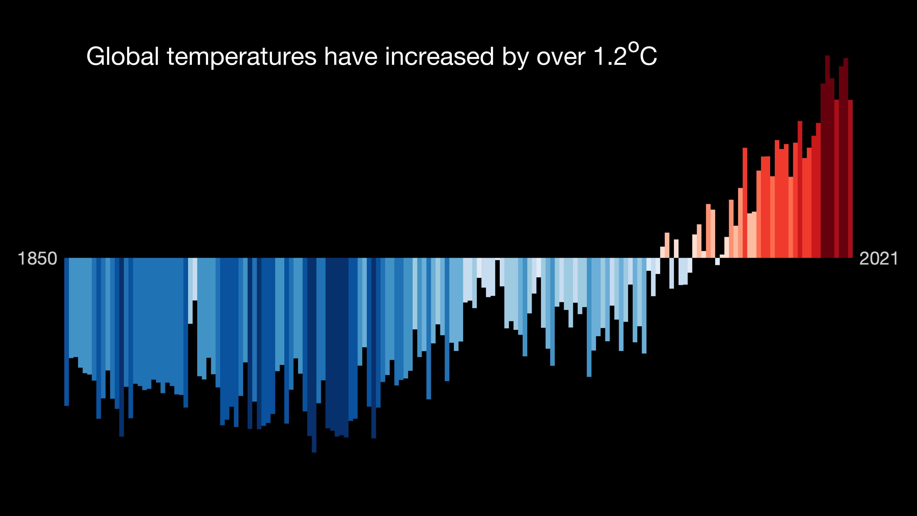
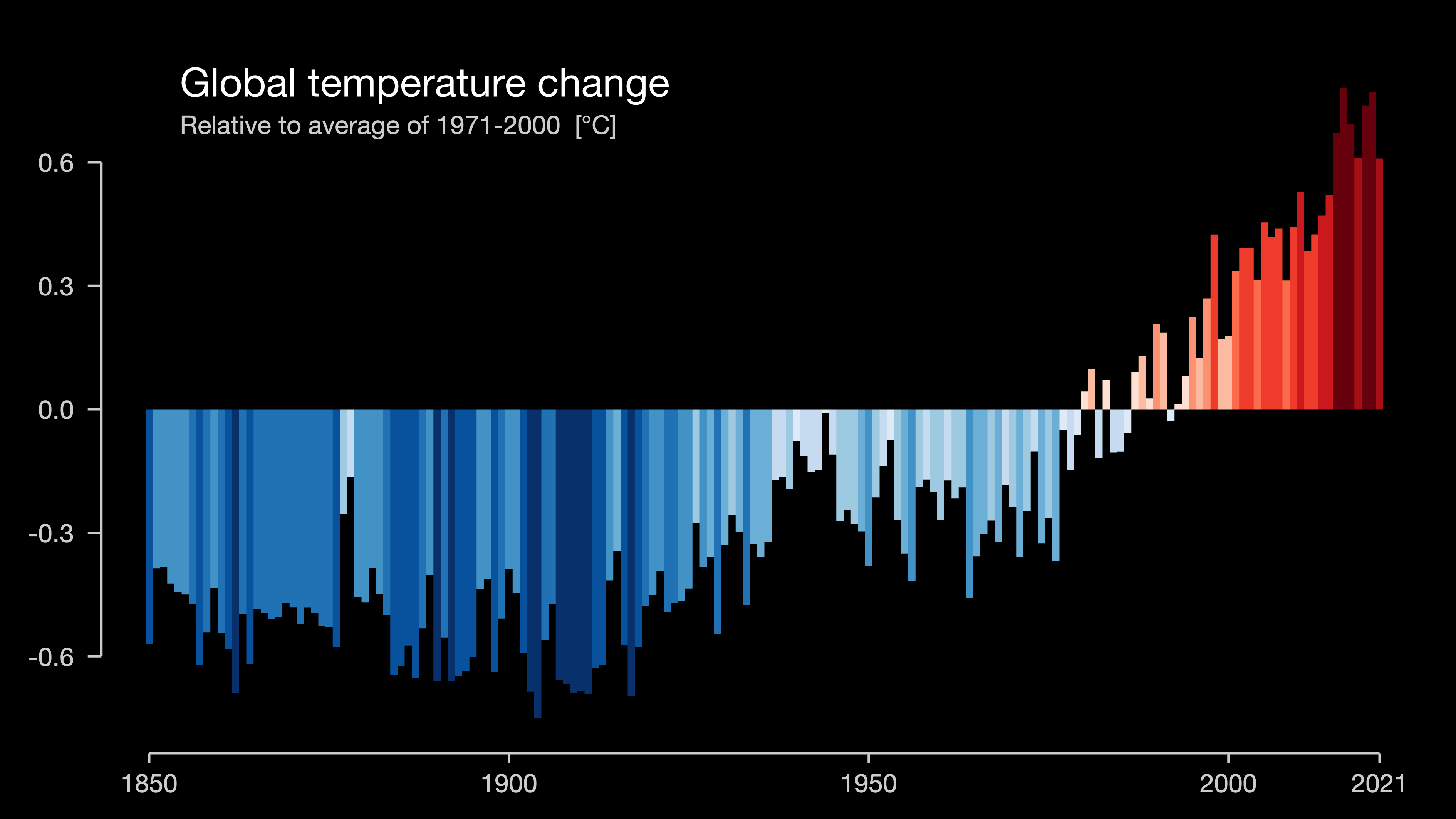
Example
❌
Temperature jargon
Relating climate to weather
Jargon
daily maxima
maximum daily maximum
area-averaged temperature
(Possible) alternative
daytime temperatures
hottest day
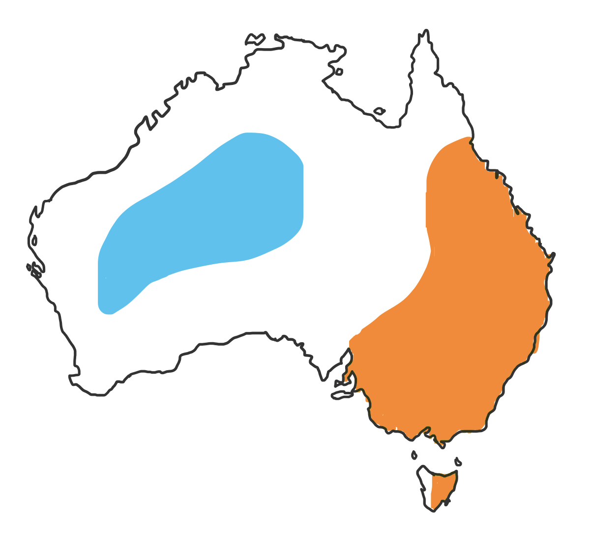
temperature across Australia
Using less jargon

A satellite map, featuring reported temperature trends in different parts of South Australia
Using less jargon

Graham Creed talking about how changes in Australian winter temperature relate to levels of global warming
Rainfall projections
and uncertainty
Perth is drying out in the winter
Cool season total rainfall (mm)
Perth has lost over 25% of its rainfall in the cooler months (April to October).
These months are critical for the growing season.
import {addTooltips} from "@mkfreeman/plot-tooltip"

perth = FileAttachment("data/perth-rainfall-obs.csv")
  .csv({ typed: true })

// convert year to date
perthData = perth.map(d => ({ ...d,
  startDate: new Date(d.year + "-01-01"),
  date: new Date(d.year + "-07-01"),
  endDate: new Date(d.year + "-12-31")
}))

// calculate man rainfallx
rainfallArray = perth.map(d => d.total)
meanRainfall =
  rainfallArray.reduce((a, b) => a + b, 0) / rainfallArray.length

perthChart = addTooltips(
  Plot.plot({
    grid: true,
    marks: [
      Plot.rectY(perthData,
        {
          x1: "startDate",
          x2: "endDate",
          y: "total",
          // fill: "total"
          fill: "#7ceaf2",
          title: d => `${d.year}\n${d.total} mm`
        }),
      Plot.linearRegressionY(perthData, { x: "date", y: "total" })
    ]
  }),
  {
    fill: "#2478bd",
    stroke: "#2478bd"
  })
import {addTooltips as addTooltips} from "@mkfreeman/plot-tooltip"
Messages
- Winter rainfall going down
- Bad for agriculture
- We expect the decline to continue
- Less warming = less decline
Challenges
- This decline is clearly in the cool season (esp. winter)
- We have seasonal rainfall projection figures, but…
- Only annual maps (not seasonal)

Establish critical time for agriculture
Only mention of seasonality is here 😔

Establish observed decline
(These are annual figures - note smaller trend)

Continue to future projections

Note that legend is the secondary way of establishing colour scale
- (Good if it gets republished online but unlikely to be read quickly, especially at this size)
Annotation establishes range and headline
Visual alternatives for uncertainty
Tooltips?
- Great for an interactive… not so much for broadcast 😔
(Di/tri)chromatic maps
- Too esoteric for TV audiences 🤔
- Probably violate contrast guidelines as well
Non-visual alternatives for uncertainty
Choosing stories where we can be clear
- (But recognising that stories featuring uncertainty are still important and looking for the best way to tell them)
Highlighting sources of uncertainty where they’re relevant, instead of putting all the fine print on all the time
Conclusions
Graphics should be digestible quickly…
but still useful if read for longer
Use language and context to reduce cognitive load
You have many tools for conveying complexity…
and not just visual ones!
Thanks for listening!
Questions?